Introduction
Overview
The use of isotopically labeled tracer substrates is an experimental approach for measuring in vivo and in vitro intracellular metabolic dynamics. Stable isotopes that alter the mass but not the chemical behavior of a molecule are commonly used in isotope tracer studies. Because stable isotopes of some atoms naturally occur at non-negligible abundances, it is important to account for the natural abundance of these isotopes when analyzing data from isotope labeling experiments. Specifically, a distinction must be made between isotopes introduced experimentally via an isotopically labeled tracer and the isotopes naturally present at the start of an experiment.
The Labeled LC-MS Analysis factors out the contribution from the Natural Abundance (NA) of each element from the signal of each isotopologue peak obtained from LC-MS techniques in a labeling experiment. It provides visualization for fractional enrichment and pool totals for single as well as dual-labeled data.
Scope of the Preset
- Performs NA correction on data from LC-MS experiments.
- Supports data from single (2D, 13C, 15N and 34S) as well as dual-labeled experiments.
- Visualizes cohort wise and label wise na corrected data for each metabolite.
- Performs quality checks using pca analysis.
Getting Started
User Input
PollyTM Labeled LC-MS Workflow requires the following two files as input:
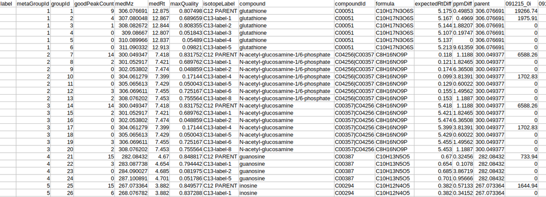
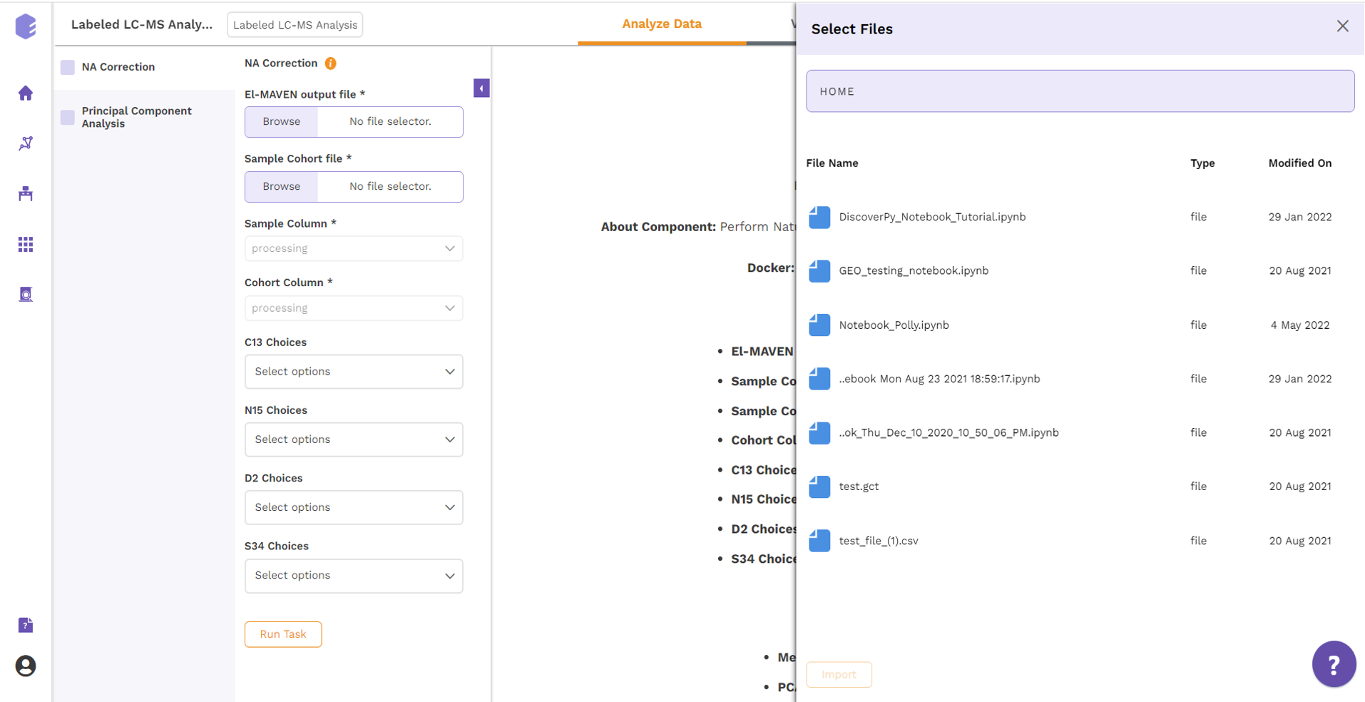
Intensity file The intensity file should be in CSV format as shown in Figure 1. The CSV file exported after peak picking in El-MAVEN is the input file.
Cohort file
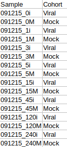
The cohort file should be in .csv format as shown in Figure 3. This file should contain two columns, Sample containing sample names along with Cohort for its cohort information.
Tutorial
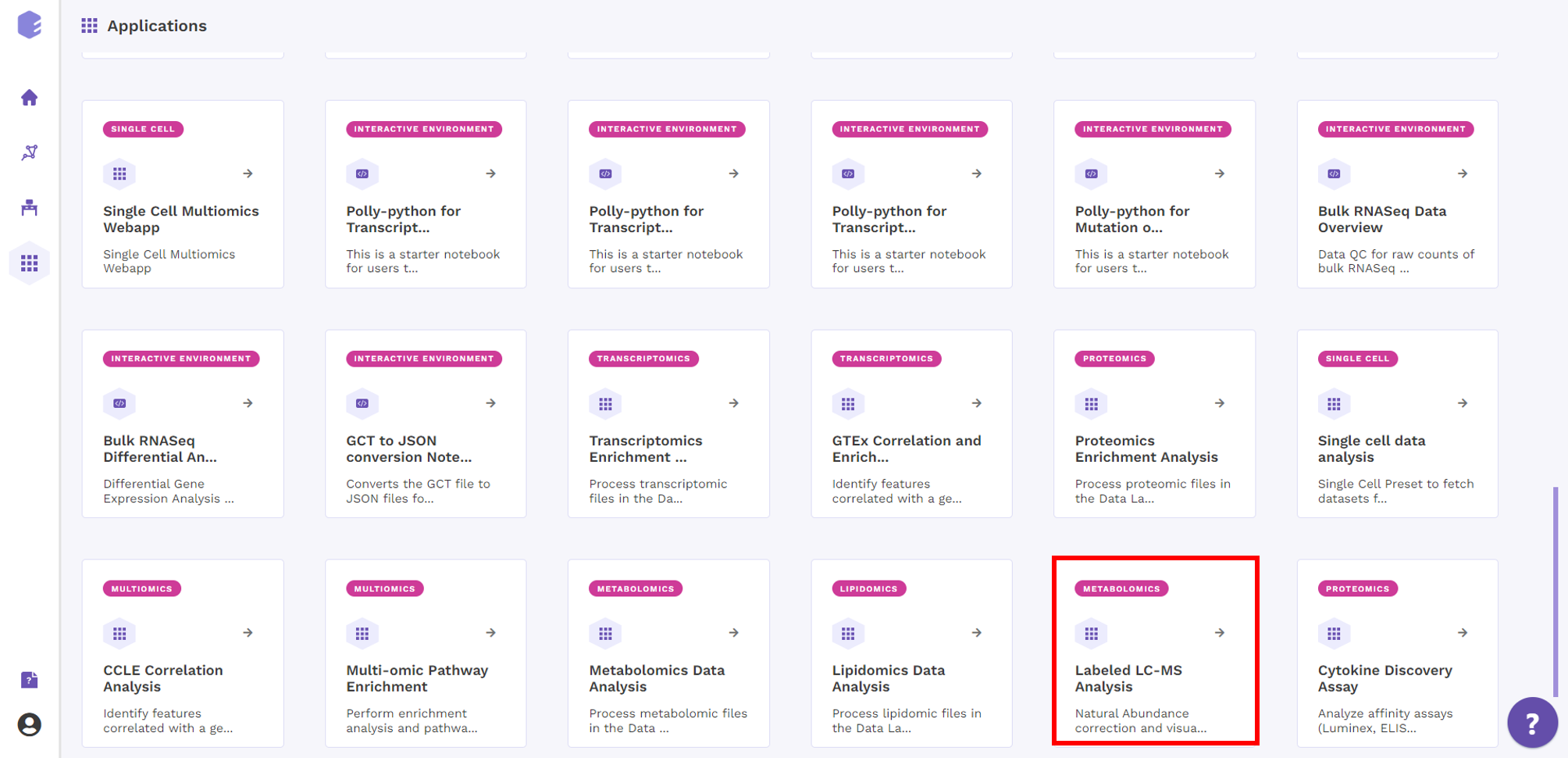
Select Labeled LC-MS Analysis from the dashboard under the Studio Presets tab.
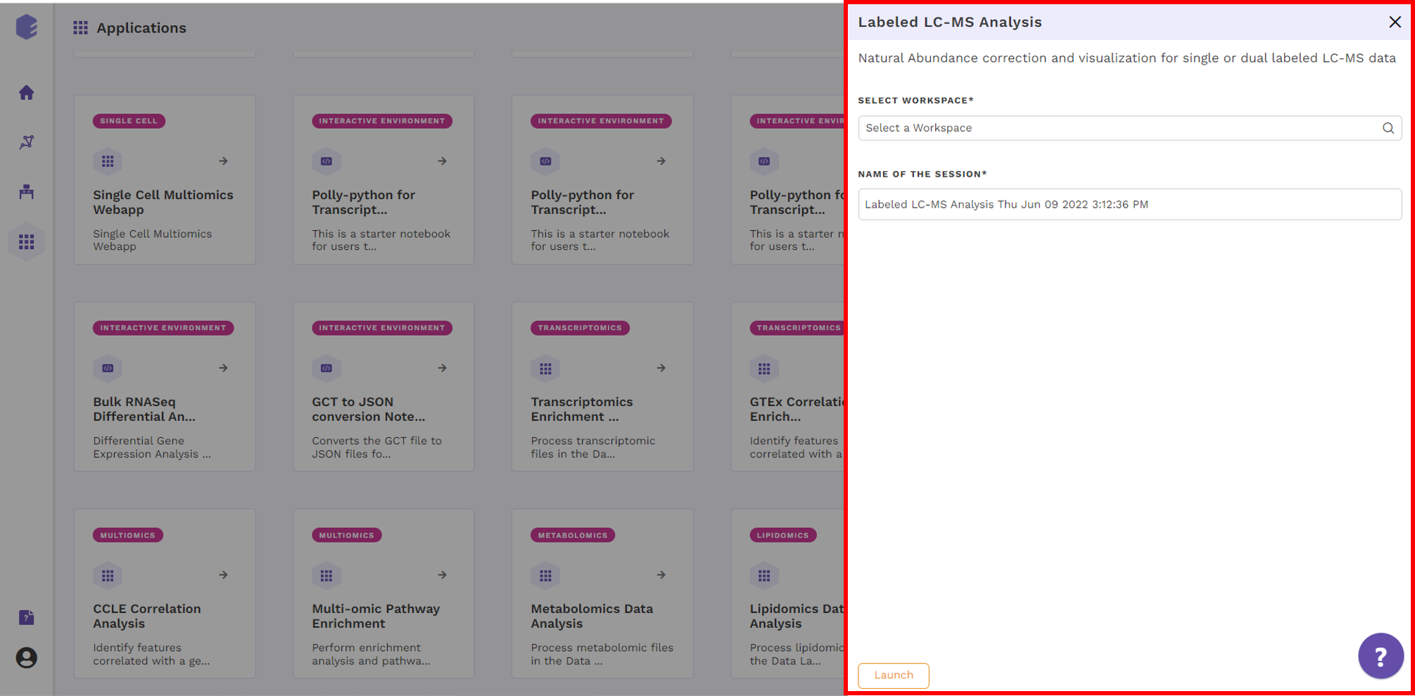
Select an existing Workspace from the drop-down and provide the Name of the Session to be redirected to Labeled LC-MS Analysis preset's upload page.
NA Correction
This tab allows you to upload the input files required for processing through the app, and perform NA correction. Once the files have been uploaded, you need to specify the parameters to run the NA correction. Isotopologue identification and quantification of thousands of metabolites in the metabolomics experiments can provide a wealth of data for modeling the flux through metabolic networks. But before isotopologue intensity data can be properly interpreted, the contributions from isotopic natural abundance must be factored out (deisotoped). This is referred to as natural abundance (NA) correction.
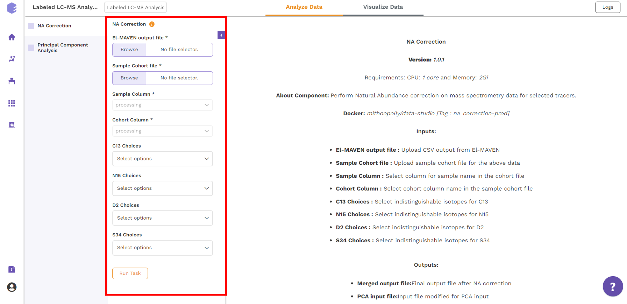
The various analysis parameters for performing NA Correction shown in Figure 5 are defined below:
- Sample Column: Dropdown to select column containing sample from the metadata columns.
- Cohort Column: Dropdown to select column containing sample from the metadata columns.
- C13 Choices: Dropdown to select the elements to be detected as isotopic tracers, when C is labeled element.
- N15 Choices: Dropdown to select the elements to be detected as isotopic tracers, when N is labeled element.
- D2 Choices: Dropdown to select the elements to be detected as isotopic tracers, when H is labeled element.
- S34 Choices: Dropdown to select the elements to be detected as isotopic tracers, when S is labeled element.
Further, click on Run Task button to perform NA Correction.
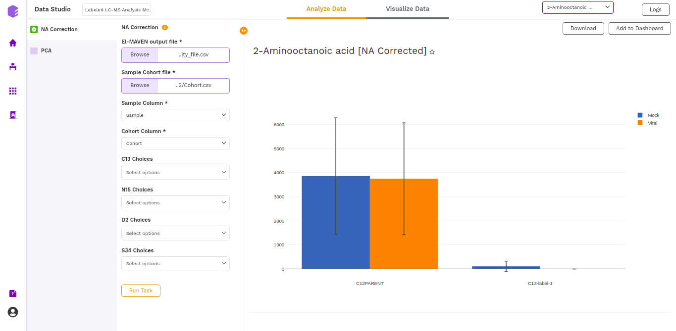
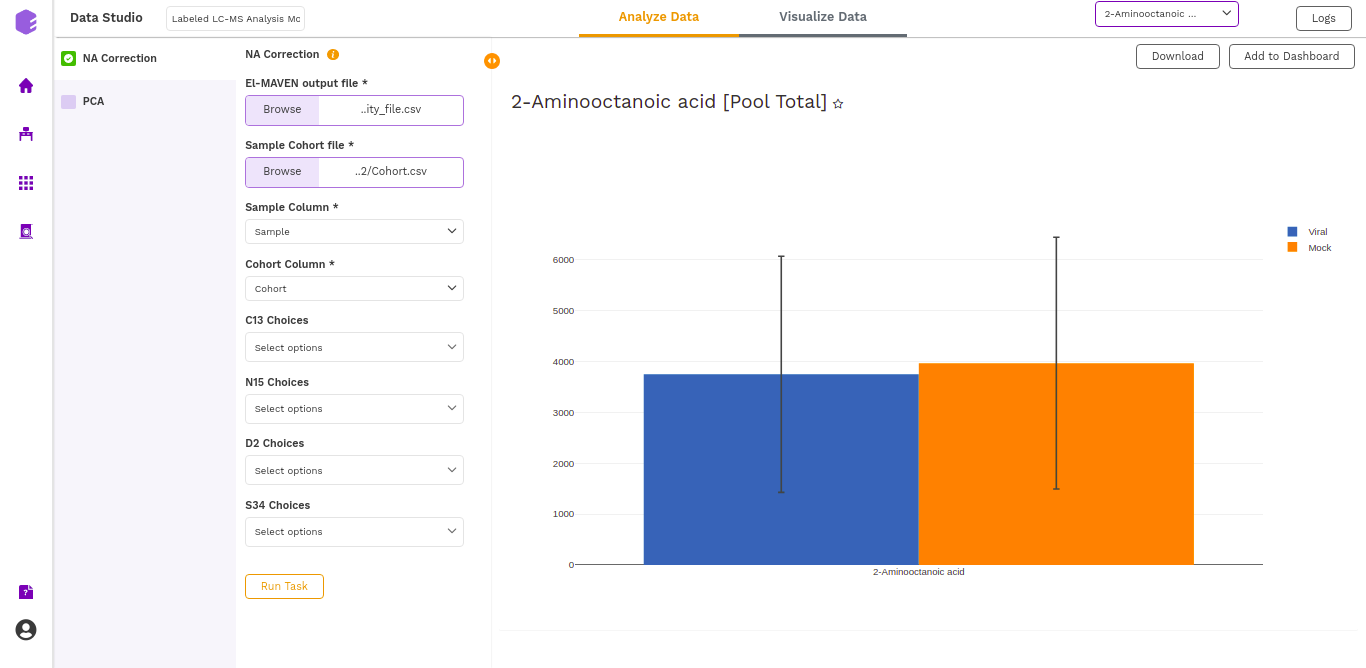
The output of this tab is the metabolite-wise Fractional enrichment, Fractional enrichment with zero, NA Corrected, NA Corrected with zero, and Pool Total plots, where each type of plot can be selected for every metabolite from the dropdown.
The various plot outputs are:
- Fractional enrichment (Cohort Wise) Plot: (Pool Total of isotopologues/Pool total of C12 Parent)
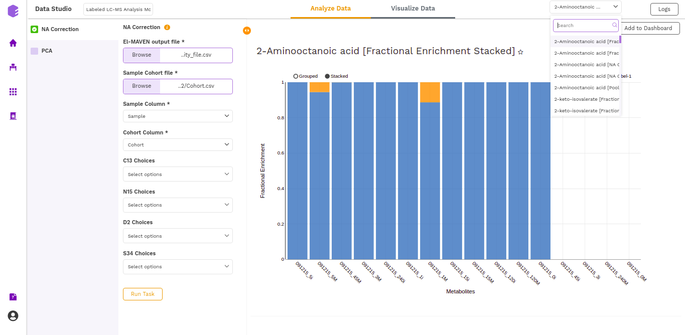
- Fractional enrichment (Label Wise) Plot: (Pool Total of isotopologues/Pool total of C12 Parent)

- NA Corrected (Cohort Wise) Plot: (NA Corrected values)
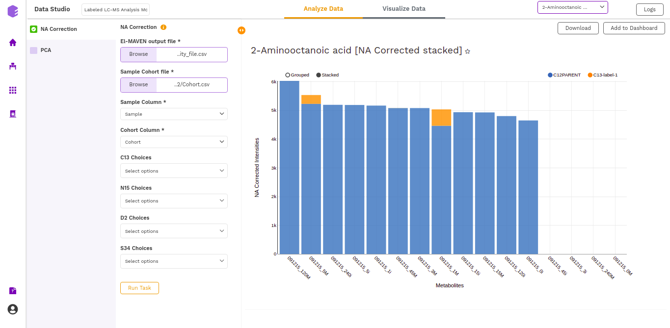
- NA corrected (Label Wise) Plot: (NA Corrected values)
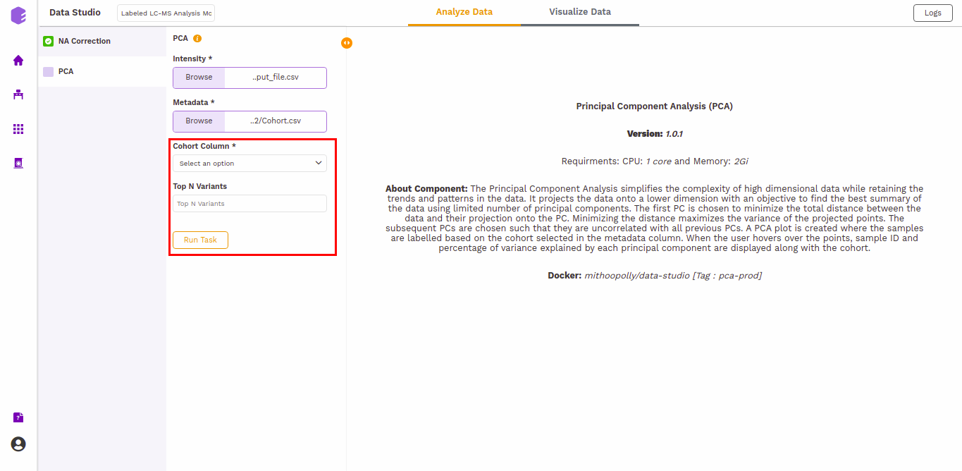
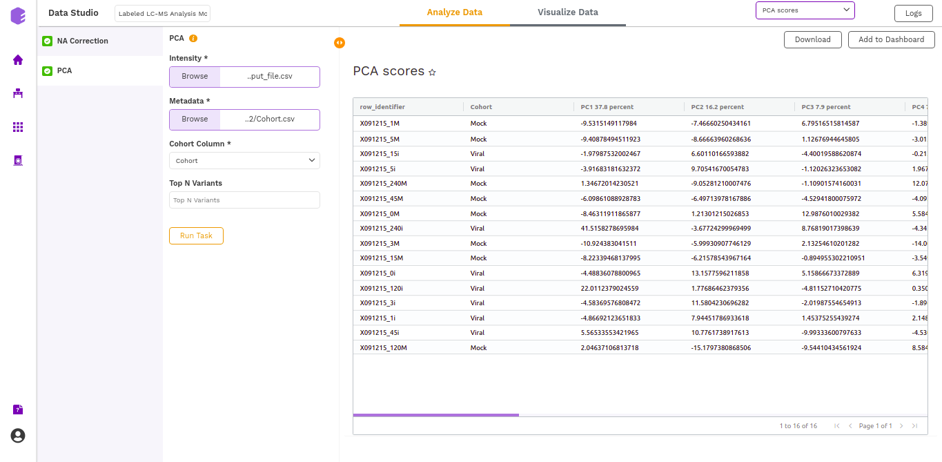
PCA
This component allows you to simplify the complexity of high-dimensional data while retaining the trends and patterns in it. It projects the data onto a lower dimension with an objective to find the best summary of the data using a limited number of principal components that help in understanding the clustering pattern between biologically grouped and ungrouped samples.
-
Cohort Column: Dropdown to select one of the metadata columns.
-
Top N Variants: The top N variable entities will be used for PCA calculation. Define the number in this box. The default number used is 1500.
It generates two outputs:
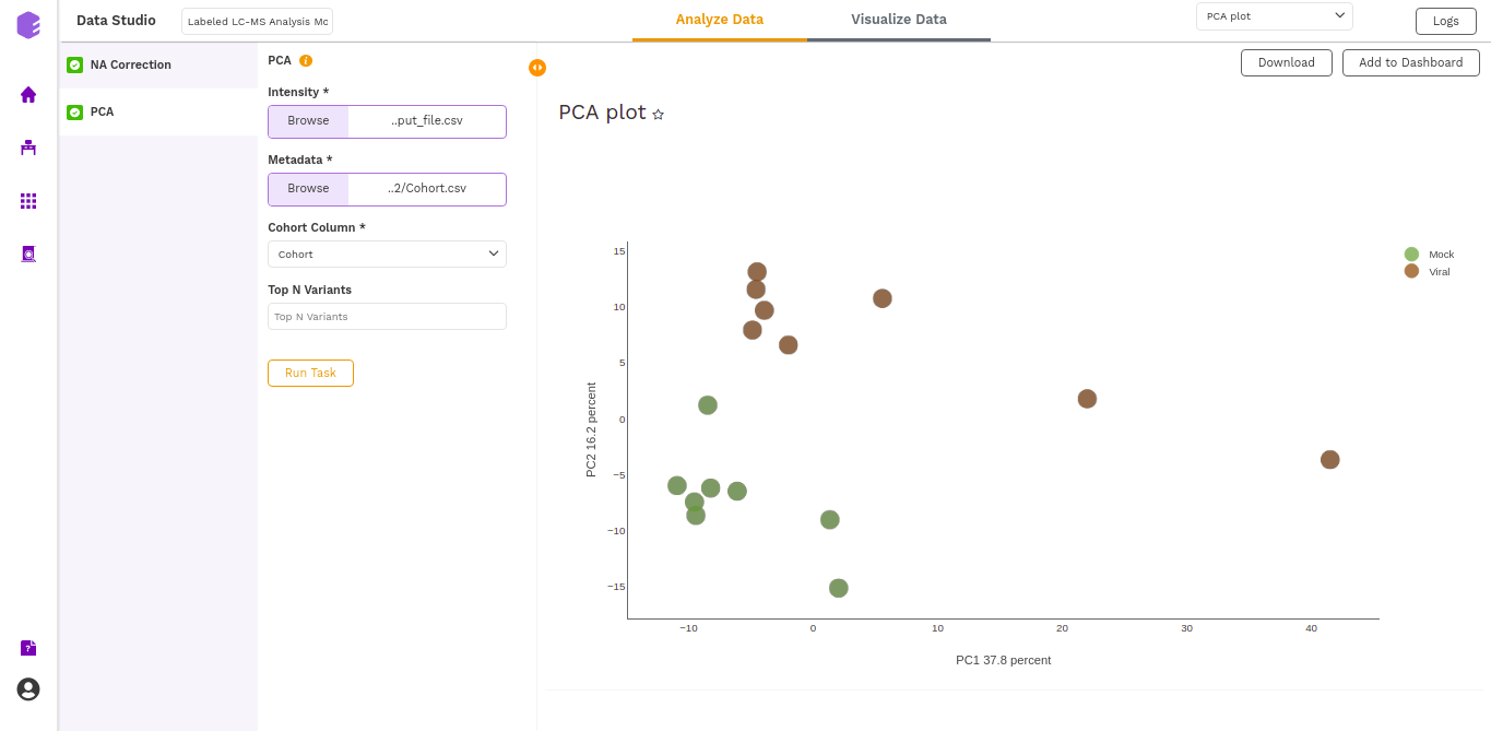
- PCA Plot: A plot is created where the samples are labeled based on the cohort selected in the metadata column. When you hover over the points, sample ID and percentage of variance explained by each principal component are displayed along with the cohort.
- PCA Score: Table of the first 10 PC values and metadata columns.
Dashboard
Data Studio lets you visualize your data with the number of highly configurable charts and tables, which you can save and add to dashboards and then customize as needed. The Visualization Dashboard provides an at-a-glance view of the selected visualization charts. The dashboard is customizable and can be organized in the most effective way to help you understand complex relationships in your data and can be used to create engaging and easy-to-understand reports. A template of the report can also be defined to generate the output if required.
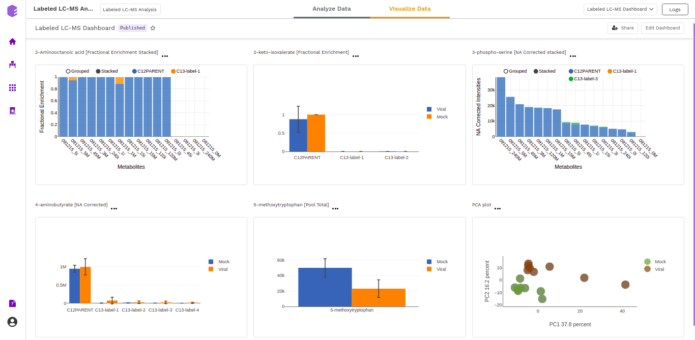
The generated reports are interactive and can be shared with the collaborators. You can easily communicate and act on the customized data where all the members of your team can compare, filter and organize the exact data they need on the fly, in one report.